This was my first opportunity in the exclusive role of a system designer. I was hired by design consultancy Môre in 2021 to work on the Smiles travel platform, which at the time did not yet have a design system, just a component library.
My main role was to have a 360 view, connecting all the company’s products and needs with design solutions, reducing friction and rework while increasing brand consistency.
Screenshots of two artboards displaying how to do a proper typography pairing for desktop and mobile, combining title and text on different scenarios
For me, the biggest challenge was entering a design system that was already partially started, without being from scratch, and having to justify and document choices that were made before I arrived by people I didn’t get to know. I didn’t have a handover, and even the oldest designers at the company didn’t know how to explain certain choices that were made, like the grid, for example.
Screenshot of three artboards displaying the different grids set for the different breakpoints
This is pure reverse engineering. It’s like I have to take a machine apart to find out how it works. And that’s exactly what I did.
I analyzed the design structure, function, and operation; I talked to as many people as possible to understand the concepts of branding, engineering, and design. I put all this together with Nielsen’s heuristics, design, and geometry concepts. Luckily, it worked out, and I found a way to avoid redoing what was already done just because there was no documentation.
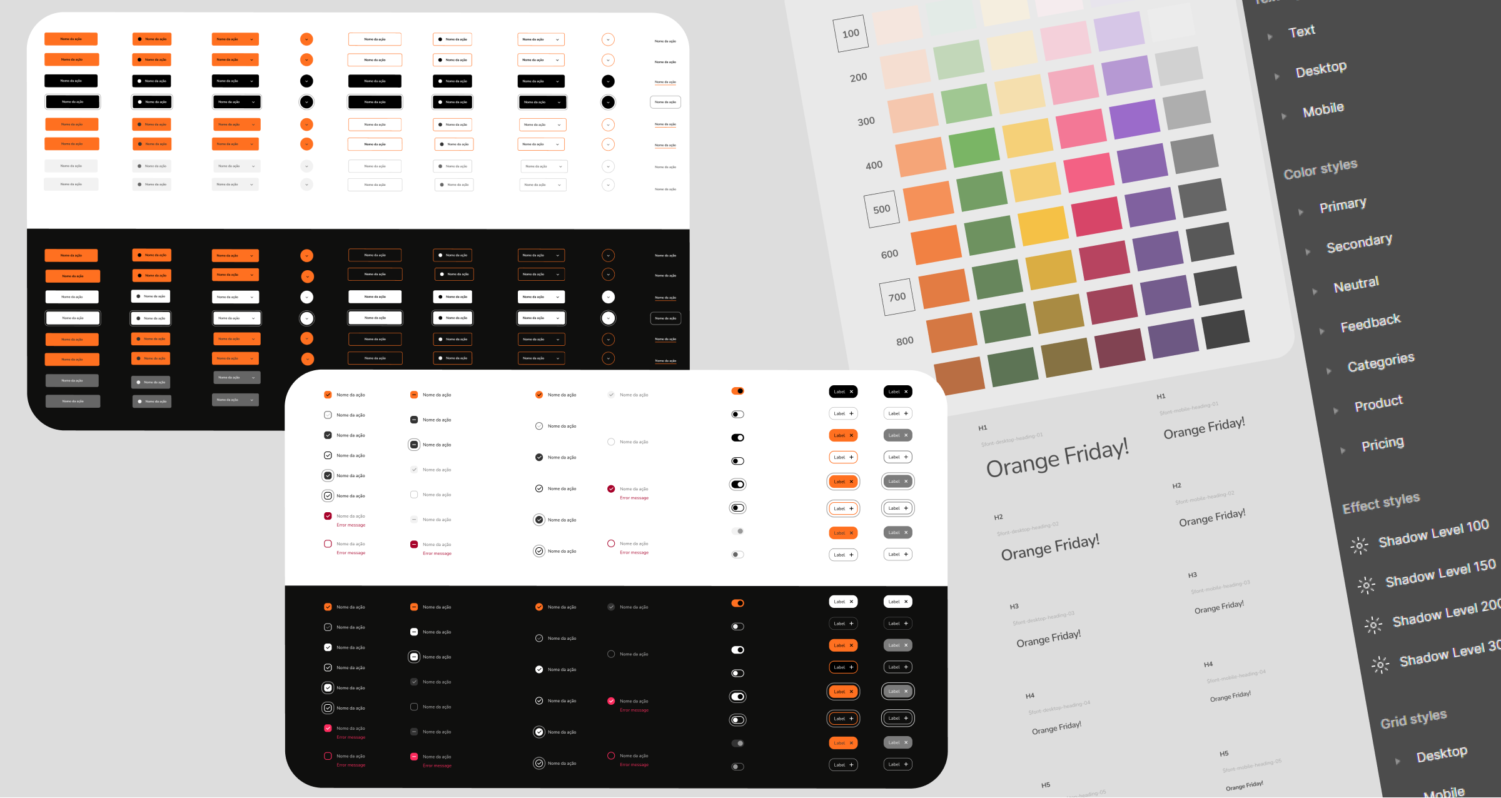
Screenshots of a component map for the buttons, crossing different properties and hierarchy both on light and dark theme
I made a standardized documentation for all the tokens and the components that already existed, giving meaning to them, rules, use cases, and best practices for both light and dark themes.
Another important challenge was related to accessibility. Smiles is a consolidated brand belonging to the Gol aviation group, whose main color is orange.
Orange is one of the least accessible colors for digital products, yet the primary brand color. I had to work around that, improving accessibility first through spacing, typography, UX writing practices, and proportions to be able to scale the conversation around brand accessibility.
Screenshots of three artboards of the documentation sections for the color tokens
Team structure
1 product designer + 1 UX writer + 2 software engineers
Figma library
40+ components
9 tokens
3 products