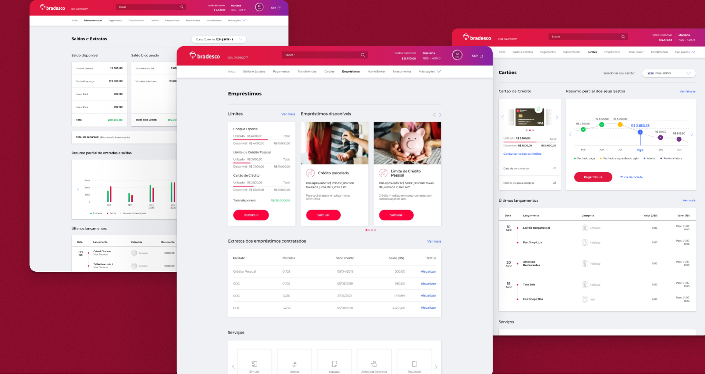
From 2019 to 2021, I participated in a large project that contemplated redesigning several products within the Internet Banking (mobile and desktop) of the Brazilian bank Bradesco to project and ensure that the user had the best experience possible.
I had the opportunity to work in many different banking services and learn a lot about financial transactions. We worked in pairs, me as a senior UI paired with a senior UX, and we did everything together, from diving into UX problems to refining the UI to the maximum pixel-perfect level of delivery.
Screenshots of three different sections of the Balances and Statements service
The biggest challenge of my position was to innovate and think of improvements for the second-largest private bank in Brazil. Although the users had the most varied profiles, the design core has to be consistent, deliver the same patterns for the experiences, and optimize and simplify the way bank services work because sometimes these services are very complex, even for heavy users.
Screenshots of two different Card service sections
Bradesco is a very traditional bank, but they were open to our ideas of simplifying the interface with better design and experience. Of course, there were many business rules we had to follow for each service, and it would be easier only to redesign the interface. Still, we couldn’t help not making the experience better, even if that made the UX/UI challenges close to impossible sometimes.

