The third design system I worked on from 2021 to 2023 is called Reverb.
When I started at Rock Content, there were already a series of components and tokens that were inherited from the Chakra framework in late 2020. Rock Content empowers brands with digital marketing products and services.
My job was to review all tokens, components, iconography, and illustrations and adapt them to the context of our products, besides documenting everything that was revised.
Rock content currently has four products, and the design system supplies all of them, at least with tokens, as they have agnostic technology; also, the components were made in React, and not all products were in React yet.
Screenshots of the handoffs of the border color and border radius tokens in JSON, thanks to the Figma Tokens plugin (A big shout out to Jan Six)
One of Reverb’s great challenges was improving its use without breaking what was already being consumed. As the Chakra framework has many variations, it takes a long time to synthesize the options that were right for us and document the use of each one.
The color tokens were the hardest to review since they had 100 different colors, and most weren’t accessible. I spent almost two months working on it, testing with people with color vision deficiency, testing on bright monitors, and testing the color transition for the behaviors of the components. On top of that, the new palette also had to be harmonic. The company welcomed and acknowledged this hard work; they even made a t-shirt with the new palette!
Gallery with screenshots of the color tokens documentation artboards and a picture of me wearing the special t-shirt that the company made of the new palette
Another challenge was to create a robust documentation website dedicated to the design system. Previously, the documentation was on the company’s wiki page mixed with many other folders and documents. Access was not easy, and the interface was not very friendly.
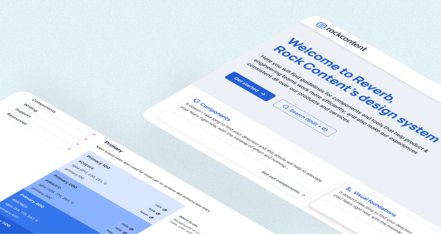
A developer and I created a documentation site from scratch. We merged the design and engineering documentation for better navigation and a whole of new interactions that make it easier to read and access.
Gallery with screenshots of the home and the introduction pages, plus part of the navigation flow for the documentation
But the biggest challenge of all was to define a roadmap for 2022/23 and try to balance this strategy with the team structure that kept on changing over the year; We went from a team of 2 product designers + 2 software engineers + 1 UX writer to just me and the UX writer.
The roadmap for 2022 was divided into quarters and displayed tracks for writing, design, engineering, collaborations, and initiatives
With no engineers dedicated to the design system, our technical debt increased very much up to this point, but we kept the upstream flow ongoing to keep up with our strategy. Also, I started sharing my DS knowledge through workshops and presentations for other designers to collaborate more.
Team structure
1 product designers + 1 UX writer
Figma library
30+ components
8 tokens
4 products